Monday, 17 November 2014

Practising in our Lesson

Today was the first time that my partner had practised my design on me and for her first attempt, I think she did pretty well. We both came to the lesson very organised and set up and started right away. I bought my face chart designs with me and some step by step notes and diagrams on how I wanted the makeup to be applied. I also bought any extra products that I needed such as eyeshadows and soap to block the eyebrows. And my partner bought her kit with all the brushes and any extras that she thought we may need.  

 This is me in the chair before I got made up, we pretended like this was the real thing so we put all the notes and face charts on the mirror and set up in a professional manner. 


This is how it turned out, I think its good especially as she had never practiced this look on me before. She started off using a smaller brush which made the eyeshadow quite heavy and you could see the lines as it wouldn't blend properly. We then tried a bigger, softer brush band it made it so much more easier to blend. The eyebrows are a bit of an issue here as they are really hard to block, so we are going to practice this again in our own time and focus mainly on getting the eyebrows blocked out. My tutor, Kat gave me a good tip - she told us that when we block out the eyebrows push them upwards so they get stuck to the skin rather than the actual hairs itself. I will give this a go but if this fails, I have thought about getting something to cover the eyebrows such as paper eyelashes and then painting and colouring them to match the makeup as this should take all the attention away from the visible hairs and stop them from being seen.


Sunday, 16 November 2014

The Prosthetics Event

Image from: http://www.theprostheticsevent.co.uk/wp-content/uploads/2014/10/PROSTHETICS-EVENT-LOGO.png


It was a very long drive to The Prosthetics Event in Birmingham (especially as the SatNav took us the wrong way!) We eventually made it there and it was very interesting to sit in the lectures and watch the way Niell Gorton works and learn about the things he does and uses. I found it helpful and took a few notes of what to use and how to do it. I took far too many pictures to post on here, so here are the best ones.

Creating a 'Guardians of The Galaxy' inspired character


 Actor Spencer Wilding was also there, best known for his part in The Wolfman.

Image from: http://www.bgfx.co.uk/_images/portfolio_images/The%20Wolfman/photo2-The-Wolfman.jpg 


The Reel Eye Company
Jemma Puri who works for The Reel Eye Company was there demonstrating SFX Contact Lenses and you can see in comparison to her hand how big they are!


Fangs FX
 Chris Lyons who works for Fangs FX demonstrated his SFX Dentures and how to put them in the correct way. 

You can make a character look great with makeup, but it the finishing touches like the eyes and teeth that brings it all together. I didn't realise this until I watched this demo and it was so interesting watching this character come to life step by step. 


MAKUP - The Academy for Film & Media Makeup


We managed to spot people creating Elizabethan makeup which was interesting to see how other people interpret this look. They stuck to the more original 16th century look whereas we are creating contemporary versions but I couldn't not post it on here as it is so relevant!


Surgery Portfolio
Not only did I get the chance to go to this event, I also got the amazing experience of a one-to-one interview with Rob Mayor! 
I showed him some pieces of my work and he gave feedback and told me areas in which I could improve, he gave me advice and tips on how to create good pieces of work. It was really interesting to learn about his background and the techniques he uses, I found it very helpful and I will take on board all the information he gave me and I will continue to develop my work making the best I can. 

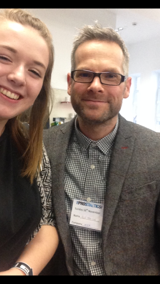
(Had to get my photo taken with him!)

Adapting Face Chart Designs

This image was my original design, I really like it but I feel that it is lacking something. I have played around with this design and experimented with it in different ways to see which works best. Below are my adapted designs. 


In these two images above, I have played around with the intensity of the colour, I don't really like how dark it looks on the cheeks as you can see the lines either side and I quite like it more softer and a blended in. I wanted to make a heart shape in the face to see how it would turn out. I would leave the face pale and then add colour around it to make it into a heart. I don't like how it has turned out, I think it looks too much and you don't really know what to focus on! The image on the right, I have changed the colour of the lips, incorporating the purple under the eyes but I don't like it as I feel it looks too heavy and takes all the attention away from the eyes. I have also decided to add a splash of colour at the top of the head but again, I feel it looks too much. 


As the designs I have adapted look too much, I decided to keep this one really simple to see how it would look. I would block out the eyebrows and not apply the orange to it, just keep the cheeks and purple under the eyes. I have used red and orange for the lips but i feel it looks quite dark, so I would make them a bit lighter. I do actually like this design as I go by the saying "less is more", I feel it could work quite well. 


Practising on myself

 I blended Skin Base Illamasqua with my own foundation (for quickness!) I would mix my skin colour perfectly first then gradually add in the white. 

 I want it to be an off white colour, so it doesn't look too pale. 

I then applied this to my face and buffed it up and powdered so it stays. 


Design 1

 I applied the eyeshadow around the eyes and the cheekbones. I got a small brush and applied purple under the eyes and used Kryolan Supracolor on my eyelashes as I haven't got a white mascara. 


 I used vaseline before to prep my lips and then applied eyeshadow to them to match the colours on my eyes exactly. I chose red and orange and then softened it down with white. I also took my foundation and patted around the corners of my mouth so that it wasn't a perfect defined lip. 


Design 2:

 I applied the orange I used on my cheekbones to my eyebrows and it was difficult as when I was applying it it was taking the white base off the eyebrows, making the hairs visible.

 I thought about how I could try and prevent this from happening and I decided to dab the eyeshadow on my eye and then apply more foundation on it and dabbed it on again. I feel this worked quite well as it wasn't as visible as the other. 


These are my overall designs, I like both of them for their simplicity but I feel it needs some more work. I am happy with the vibrance of the colours as I want it to look quite natural on the face and I am pleased with the choice of colours as these are what I feel represents royalty to me. I like design 1 because I like how natural it looks, but I feel like when you look at it front-on, it looks so plain. I like idea of design 2 because the eyebrows are covered, but because my eyebrows are so dark, its making it harder to cover and I don't like the way you can see through. If I can get the eyebrows perfectly blocked out then that will be the design that I choose. I will get my model to practice doing my design and see how it turns out, it may need some more tweaking and adapting but I think the only way I will find out if it will work is if my model practices. 

Friday, 14 November 2014

Practising and Adapting my Design

This is my favourite design at the moment, and it will be the one I work on and develop to make it look better. I have practised on myself as this will be the design that my model will create on me. 


I started off with blocking out my eyebrows and then I mixed in skin base white with my foundation to create a slightly pale skin colour. I then copied my face chart but I felt something was missing.

I then started to bring the orange down to the corner of my eye and I flicked out the purple underneath my eye to make it look more dramatic. 

I like how soft the colours look but I want to experiment with the colours being more vivid. 


I like the orange lips as it brings out the eyes, but I think they need to be a little bit softer as they are quite bright in comparison to the eyeshadow. 

I didn't have any white mascara to hand, so I used white Supracolor to give the impression of white eyelashes which I think works really well. I like the pale complexion and how my cheeks look as it I feel it gives it a nice warm feel. I think I need to either add more layers of soap to cover it, or add a thicker layer of the white skin base and then put my eyeshadow on as you can see the hairs coming through the colour. Overall I do quite like this look but I will continue with my face charts and adapting it to see if I can make it to the best of my ability. 


I then wanted to try out my other design that I liked, just to compare the two and see if it turned out better.

I added on the red base of eyeshadow and used Supracolor to add the flicks on the eyes and the Black underneath. 

I then used my red shadow and contoured the cheekbones and around the eyes. 

I then painted the lips red to match the eyeshadow and then I mixed the red and black together and painted on a heart shape. Although it is contemporary, I think it looks too heavy for an Elizabethan look and I do prefer my first design. This has helped me make my mind up for exactly what I want to do. I will continue to adapt and change my design to see what works best. 


Practising One of My Makeup Designs

Unfortunately, I was unable to work with my assessment partner, so I paired with someone else to practice my makeup design on her. 


Firstly, I blocked out the eyebrows using soap and white skin base Illamasqua. Although she has blonde hair, her eyebrows are a lot darker and quite thick so this made it harder to cover completely. 

I then applied the orange to the eyebrows, blending into red and orange on the cheeks. I then added the purple underneath the eyes to compliment the orange. 


I do like this design but it definitely needs some work. I need to work on blocking out the eyebrows and maybe even the intensity of the colours because it is lacking something. I will practice this design on my face and see if I can improve the look of it and maybe adapt it to make it better.